
More resume templates
Browse all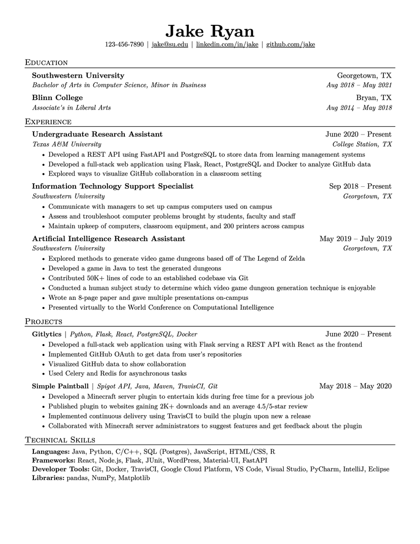
Jake's Resume
dense · serif
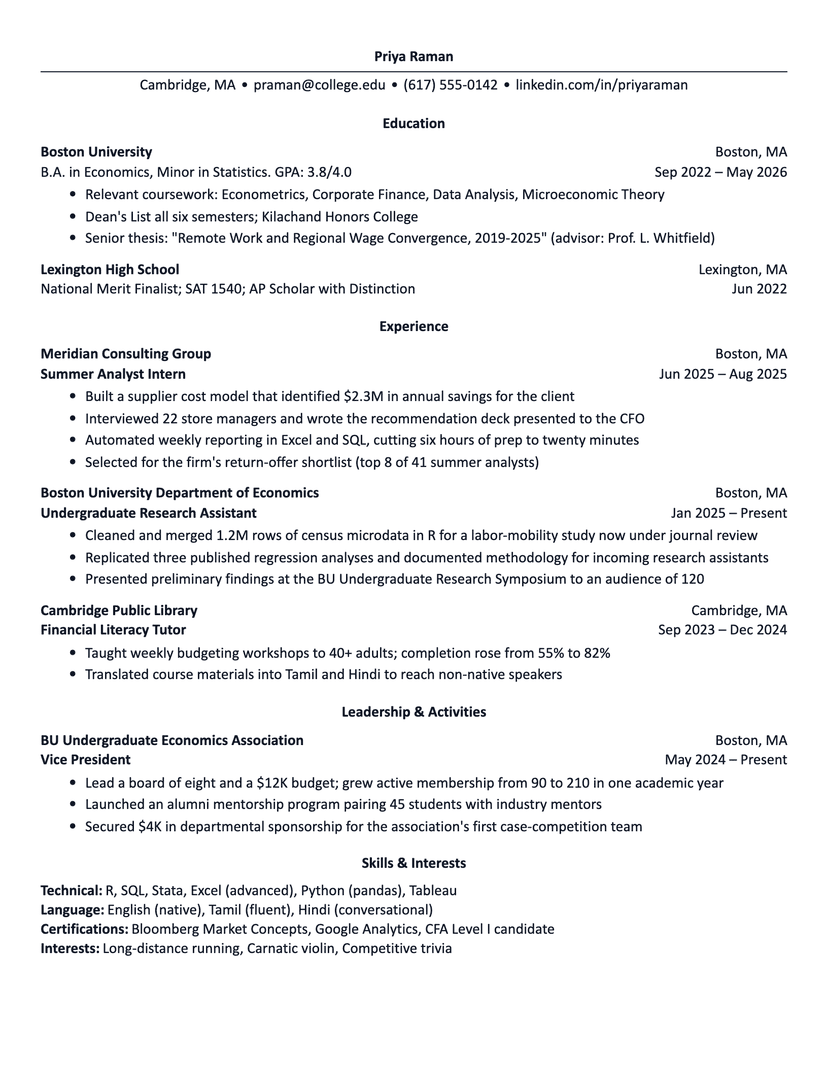
Harvard
academic · plain
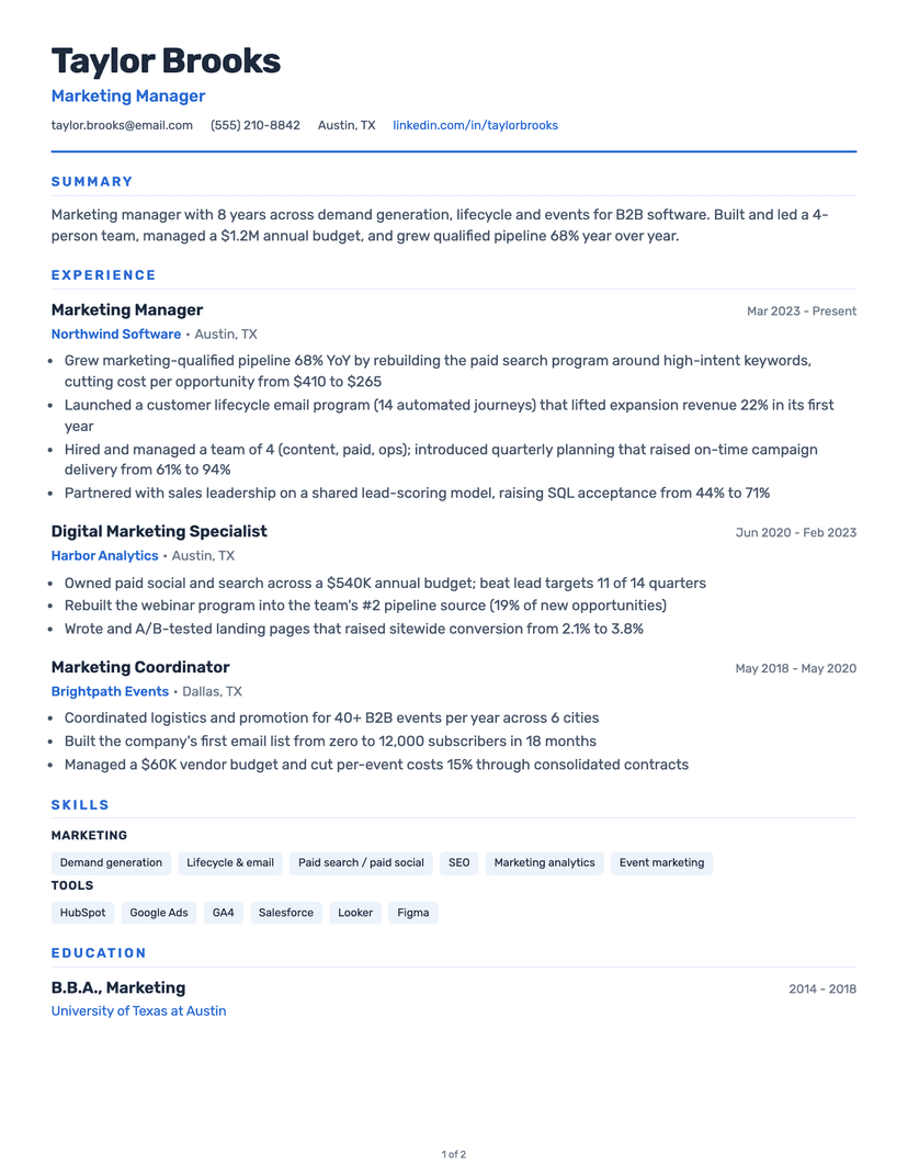
Classic
clean · traditional
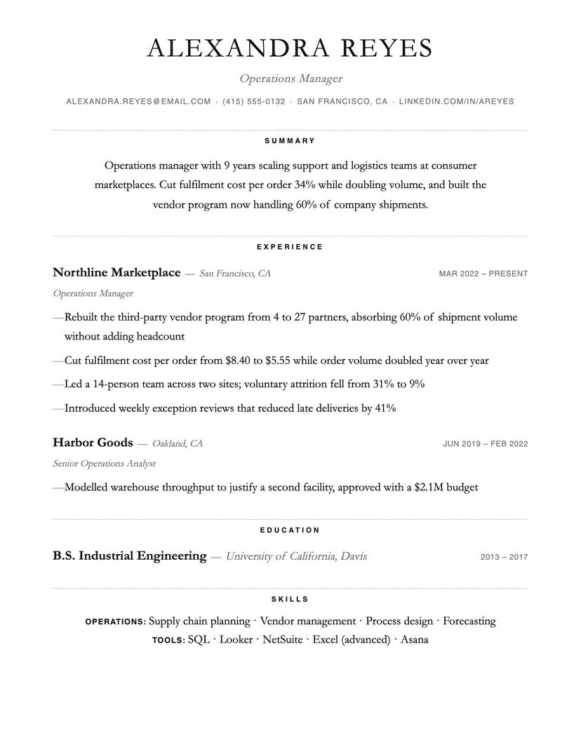
Dotted
minimal · centered
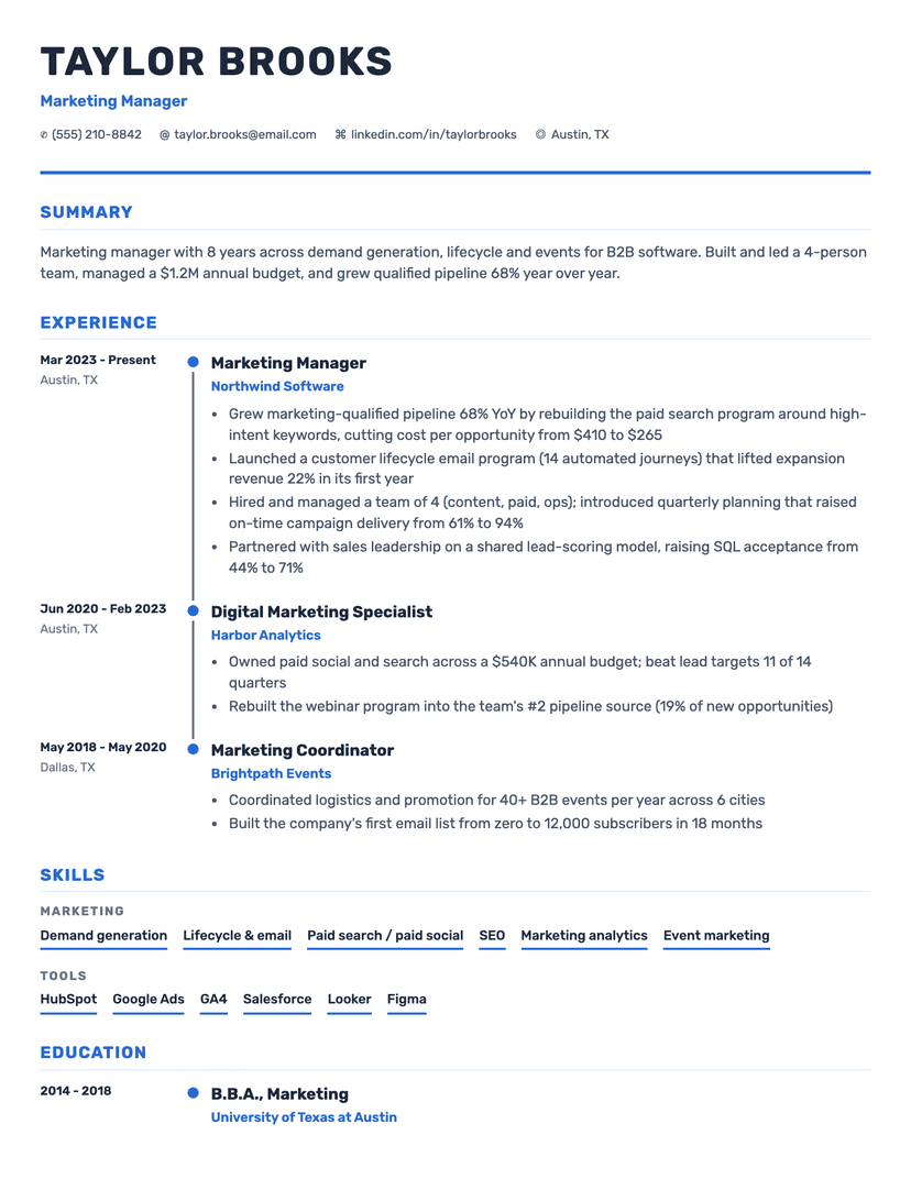
Timeline
timeline · visual
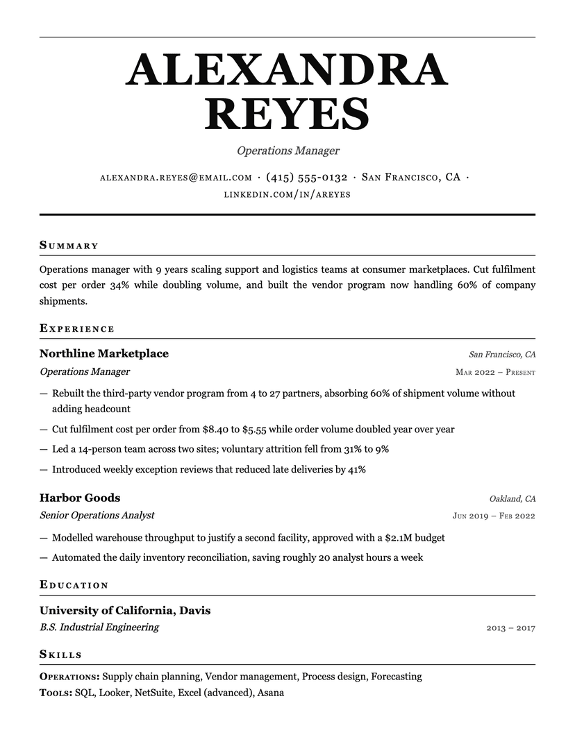
Broadsheet
serif · traditional
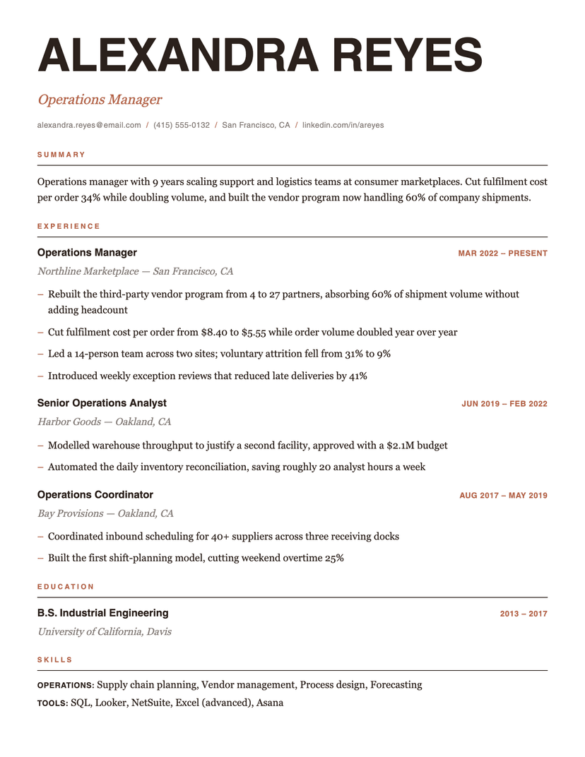
Editorial
modern · editorial
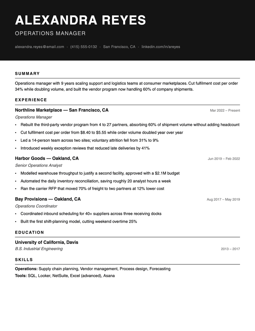
Ink Block
bold · monochrome
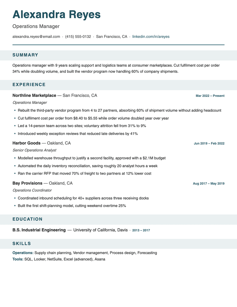
Banner
bold · structured
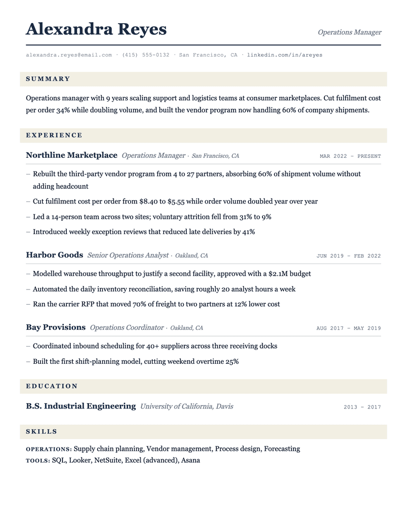
Ledger
serif · traditional
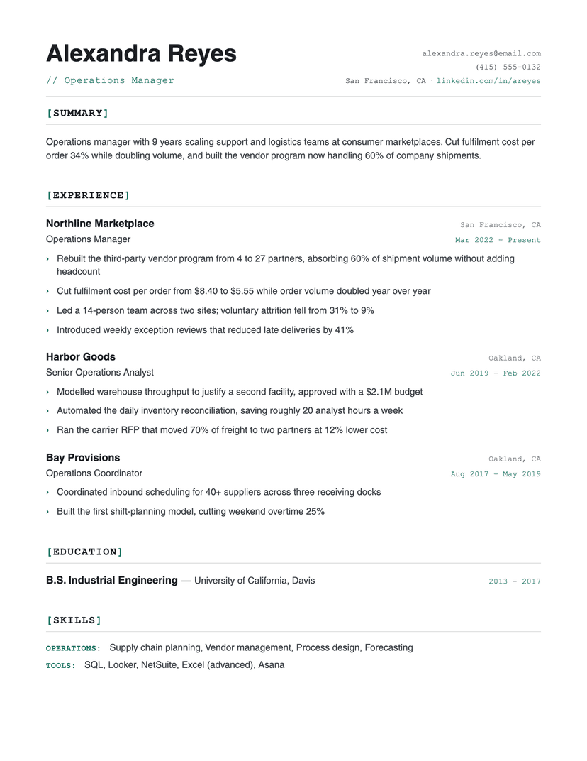
Bracket
technical · monospace
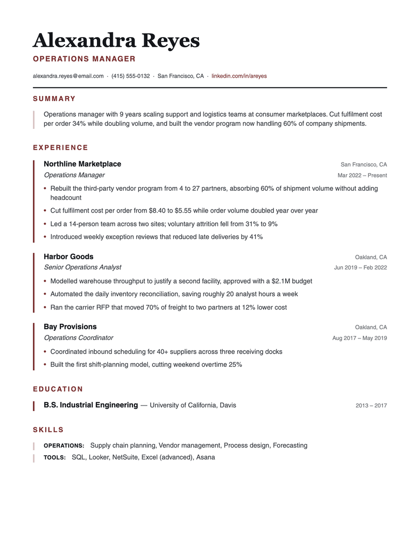
Left Rule
structured · serif-header
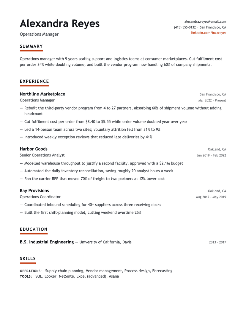
Underline Accent
modern · monochrome
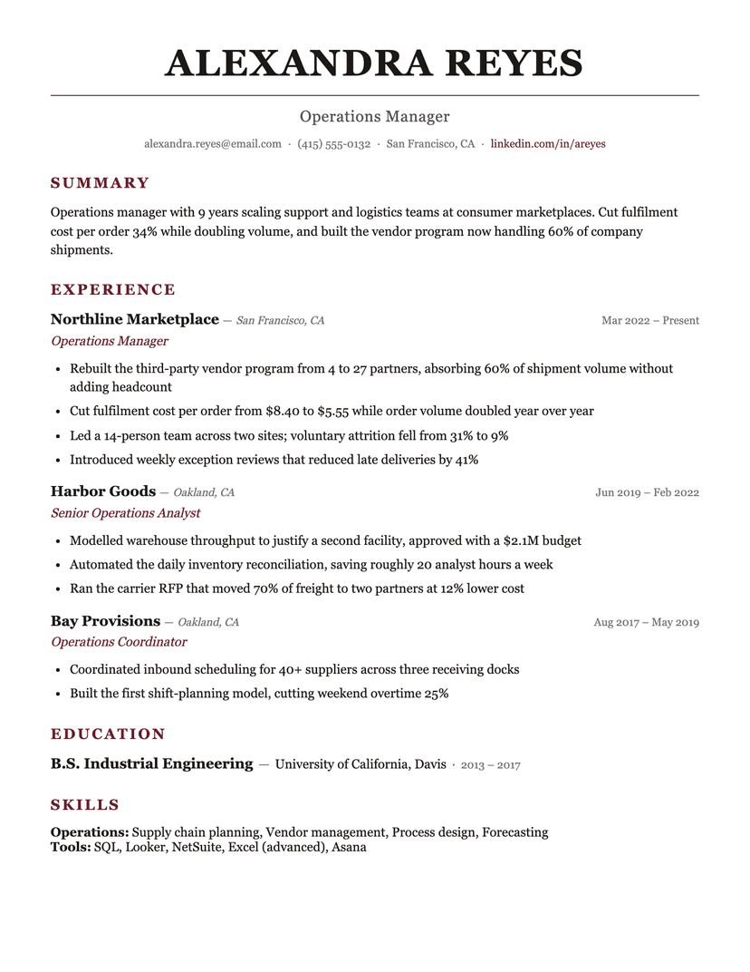
Burgundy
formal · serif
This template is also in
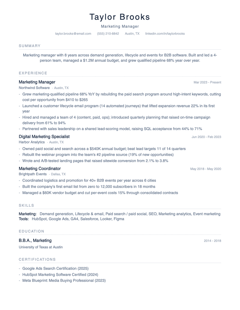
About the Minimalist template
Whitespace is a reading feature, not wasted space
Most "minimalist" templates on design marketplaces are actually decorative — sidebars, icons, skill meters. Real minimalism is typographic: this template creates hierarchy with size, weight and spacing alone. The practical effect is skimmability — in eye-tracking terms, wider margins and looser line spacing reduce regression (re-reading), which is exactly what you want from a screener giving you seven seconds.
The centered header is the one stylistic liberty, and it's a parser-safe one: it remains plain body text at the top of the document, not a graphic header block.
How it parses
Identical structural profile to our Classic: one column, standard headings, no tables or text boxes, contact details in the body. Minimalism actually helps here — there is simply less on the page for a parser to misinterpret. The monochrome slate palette also survives black-and-white printing and low-quality PDF re-rasterization without losing hierarchy.
The honest tradeoff: sparse content looks sparser
Whitespace amplifies whatever it surrounds. Three strong bullets per role look deliberate and confident in this template; one thin bullet per role looks like you ran out of things to say. If your history is short, either write toward substance first or use Jake's, whose density flatters thinner content. Minimalist rewards people with strong material and the discipline to cut.
Who the Minimalist template is for
Great fit
- Professionals with strong, quantified accomplishments who want them to breathe
- Design-adjacent and startup roles where taste is quietly evaluated
- Anyone whose current resume feels cramped and cluttered
Look elsewhere if
- Thin or early histories — whitespace exposes sparse content (use Jake's)
- Maximum-content-per-page needs — this template deliberately fits less
Frequently asked questions
Are minimalist resume templates ATS-friendly?+
This one is — it's minimalist in typography, not in structure. Single column, standard section names, no graphics. Many marketplace "minimal" templates fail ATS parsing because of sidebars and icon fonts; the aesthetic isn't the risk, the layout is.
Minimal vs. simple vs. basic — what's the difference?+
Functionally they're the same search for the same thing: an uncluttered single-column resume. "Minimalist" designs lean on whitespace and typographic restraint; "simple/basic" designs are usually denser. Compare this template with our Classic to see the difference in person.
Does a minimalist resume look lazy?+
Only if the content is thin. With quantified bullets, restraint reads as confidence — the layout says the work speaks for itself. That's also why we recommend writing your bullets before choosing this template.
Already have a resume? See exactly what an ATS parses out of it.
Run the free ATS checker